Pages

Saturday, February 7, 2009

Soulmate

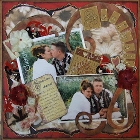
Good Morning everyone. Here is my latest LO. This was inspired by ... yup you guessed it... Valentines day. This is dedicated to my Soulmate. The man I love. My mother took these photos of us in the hills of Tucson AZ. This was about 5 years ago though. I still just love the way they capture the natural emotion, that is something no studio photo can do.

Now down to the details. I will start from the back and move to the front with the explanations.
Background papers:
I started with the Medium brown as my background and distressed the edge with red ink. The red paper was actually added later when the LO was looking to brown. I cut it down to 11 1/2 inches and distressed the edge with black.
To create the bracket shape I cut my flower paper down to 11x11 inches. On the back of the paper I measured and marked the half way point at 5.5 inches on every side. I used that as my center point and free handed the shape from there around the corner and to the next mark on the next side. Rinse and repeat this three more times. Then cut. Once the shape is done I took it and set it face down on top of the black paper and traced the shape 1/4 inch larger then the floral. Took my trusty fiskars decorative scissors and cut along the line. I stickled the black edges with a red glitter and then took the Zig Painty gold pen and traced around the shape along the edge. The flower paper I distressed the edge and then inked with the red ink. The tears that naturaly happen I then rolled up to expose the black more. The large heart was freehaned out of a PP then stickeled with the red glitter and a brush. Inked with an anitque gold ink and then with a black. This helped the edge of it stand out as it was blending to much with the background.
Embelishments:
Paper:
The Title and the bingo card were printed out off the computer onto the same Cardstock that the largest bacground layer is. Then doodled on with the gold and black pens.
The Note paper was printed on a golden yellow to pull out the flowers in the pictures and then doodled on with red and black markers. Holes were punched along the side and then riped to the edge to make it look like it had come out of a note pad. Then it was distressed with cream ink and light brown chalk and edged in black ink.
The bird was a cricut shape out of black paper and then stickeled and edged in gold to match the black boarder.
The tall hearts with the box around them were off of a patterened paper I had. I used the gold pen to trace the heart with black pen accents and wrote the words. Together, Forever, You + Me
Fabric:
The silk flowers were stickeled in either an irridecent yellow or red and an eyelet was used to hold the layers together in the center. A few were inked red also before stickling. The flurished are a velvet cut from two colors, black and red, of ribbon I got after christmas for a dollar a roll.
Bling:
I just threw this on where I felt the need.

Thanks for looking and I hope this inspired you some how or gave you some ideas. Please feel free to leave a comment if you have any questions or feel compelled. Thanks!

Thursday, February 5, 2009

Scraproom

The scrap corner in my little world is actually my heaven and hell... currently it has interrupted my creative juices due to the extreme mess it has become. So the layouts are on hold for a few days while I get it under control.
I have gotten so much new stuff since December I have not found places to put it all. Now here you will be able to see the final pics when it is all done and I can relax and enjoy it. I will share all the organizational goodies I and my friends in the 28 Day challenge (to get organized) over at scrapbook.com.
So for now... got to go clean and for later... well... there is more on this subject to come!

Monday, February 2, 2009

Live in 2009

This is my New Years resolution page. Things I want to accomplish this year. I am excited because this is my first time putting this down on paper.

One of the fun things on this LO is the Resolutions are incorporated in the design elements. Thanks to Microsoft word art and clip art.

New Technique: I tried out the silk flower folding technique for the first time on this LO. They are located to the left of the Pic. I folded 2-3 layers of petals and then stickled them I also added the bottom greenery part from the original flower.

I loved the way Robinzberdz from Scrapbook.com did the boarder with the three layers and the punch on her LO called "Priceless Memories". The photo editing was inspired by Kaye222 and her beautiful daughters.

Details for Live in 2009:
The Top right:
Here is a detail of the flourish with one of my resolutions on it. "Laugh a bit more. I need to remember how to enjoy life to it's fullest." Also in this section there is a closeup of the chipboard element. I just lightly inked this with a chocolate brown then used an iridescent orange glitter glue over it. This stickles style glue was a light compliment to the copper brads. There is also the letters here "How I ..." These were printed on white card stock off of the computer and then cut apart. You can also see a close up of the boarder style I loved from Robinberdz. This is is three contrasting papers using the same boarder punch.

Top Right:
Here is most of the title. The chipboard letters and numbers were finished in the same way as the design element on top of the photo in the last detail. Here you can see the three strips of PP I used to add a bit more dimension to the background. You can also get a glimpse of the free hand drawn heart done in the burgundy PP. All my PPs were inked along the edges with the chocolate brown ink pad from Stamping up.

Bottom Right:
Here is a detail of where I put two of my other resolutions. "NO Fear!" and my "Hand over control of the camera" they were printed up along this clip art flourish boarder. I then distressed the edge and added the brads and the stickles in the heart shapes. The same orange iridescent stickles were added with a brush on all of the flower petals. A coordinating spring green color of stickles was added to the leaves to highlight the veins as seen here.

It is being submitted to the Cosmo Cricket Jan challenge.

Update: 1st place in the CC JAN challenge
Made top 4th/83 in flower challenge

A New Pair of Shoes Can Change Your Life

Welcome readers,


Ah my little Cinderella. These pictures were taken on her 4th birthday. She received a Cinderella princess dress from us that morning. She was so excited to get it she had to ware it all day. My mother was here in town and spent a day out with each of my children separately. My mother took them both to Build - A - Bear workshop. After choosing her cuddly pink teddy bear, Trinity had to pick the Cinderella Dress to match her own.

Of course she also had to have the glass slippers for the bear because as we all know... "Cinderella is proof that a new pair of shoes can change your life." This was created for the Quote of the month challenge and the heat embossing for Jan.

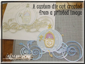
The shoes behind this quote are the glass slippers for the bear. Thought that was cute. And the Cinderella coach... *brags-a-bit* Made it MYSELF... hehe... sorry but I am soooo excited that it turned out so well.

The journaling reads around the yellow boarder in a pale pink so it is hard to see in this shot:
January 12, 2009 Trinity's 4th birthday ~ MeMaw took her to build a bear workshop. Trinity picked out the pink Teddy bear. Once the bear was filled with love she chose the Cinderella outfit to match her own. Of course no outfit is complete without a new pair of shoes. After dressing the bear we filled out her birth certificate and Bell Bear was adopted into our family. We all had such a wonderful day.

New technique: paper rolling - I used this around the edge of the boarder.


Cinderella's Coach finished on the print out from the comp I used as a pattern.

The coach pumpkin including the door is 5 piece of Cinderella Blue CS - 3 pieces of pixie dust vellum - two pieces of white CS - 7 pieces of gold CS - a 4" clip of pink lace.

The Undercarriage - is 8 pieces of Cinderella blue CS

I heat embossed the C on the door and the iridescent sparkles on the undercarriage.


Stickles - The lamp on the top and the side of the door were stickled, as well as the silver on the bottom of the pumpkin and the foot stool.

I used the Zig Painty gold and silver marker to outline each piece of the coach and to draw each of the eight pieces of the thin undercarriage before embossing it.

Thanks for enjoying this with me!

USAF

This Layout or project has been published in Scrapbook News & Review. If you wish to see it please click on the "Out for Publication" image below. Thank you! ~ Grace ~
USAF Basic Training Graduation with the family. These are pics of me and my soon to be hubby (at the time). My mom and his parents.

This was done as an example for the Military challenge- Jan I am hosting monthly at scrapbook.com. The requirements needed were stars, stripes and ribbon. I feel as if I cheated though because I got them all done in one element.

The other challenge was the Jan scrap lift where I lifted user name on Scrapbook.com Bobecca77's LO "Party".

The is a simple yet beautiful way tou scrapbook. However I used to scrap this way it is now a challenge for me to achieve a simple elegance like this. Just for the record my hubby wanted more "fanciness"... thought it was funny. I said it was a "challenge" and I needed to challenge myself to have some control to make it simple. I have a tendency to over do things.

Details:
The Flag ribbon is 4.5" wide and each of the photos was outlined in the silver Zig Painty. The silver stars are confetti and the letters are made of a silver card stock. Though there is a sentimental attachment to the stencil the letters were traced from...

When I was back home over the Christmas holiday I spent some time at my Grandparents house. This was a visit that was hard for me. I hope this is not the case but my Grandfather is not doing well and that possibly might have been the last time I will see him. While I was helping arround the house I stumbled across these letter stincils that my grandmother has been keeping for ages. I used to play with them when I was a child. I used to live in there house with my mother when our times were hard. It might sound silly but when I see or use these thin blue sheets of plastic I remember fried chicken dinners. Hambugers with homade sweet pickles and homade icecream with the oldfashon salt machiene. I also remember my dear departed Uncle Lee who was much older then I but had down syndrome and was many times my playmate and my drawing companion. May he rest in peace and may his angel wings let him fly as high and as free as he ever dreamed.

Godbless and Thanks for Looking!

Fly Boy

These are pics of my son when he was two years old. We took them at home ... well my mom did. She is such a great photographer. She has so much potential. If any of you live in Colorado and would like to contact her please let me know. Anyway. This was created in mind for three challenges from Scrapbook.com and I may put it in the doodle one for Jan as well.
Challenge 1:
Color challenge Jan - Blue Orange and white
Challenge 2:
D – Dots, polka-dots. Got them actually on two PP.
E – Envelope, some way some how you must put an envelope on the layout. Flying by envelope... hehe
F – Fiskars scissors or some type of decorative scissors or edger. Check! Done! I used the Fiskars edger with the rope design.
Challenge 3:
Doodle challenge - Jan - this requires you to utilize your markers and pen on your layout in more then just journaling. You need to add a design element to it with ink.

Details of Fly Boy:
The airplanes are from two places. the orange one is a chip board element covered in Card stock. It is from the "Obscure" [un}dressed chipboard pack from Basicgrey. This I found at Big Lots for 2$. I don't know if you will be able to find it. I know they are still at my store though. The navy blue one in the center is printed off of Microsoft clip art and cut out right along he edge and I added stickles to the wings and tail. The lettering is also just a font I have in the Microsoft word Program. I printed it in a navy blue on the light orange card stock and cut it out with a small 1/8" boarder.

Every new layout I do I try to use a new type of embellishment or a new technique. This layout the new item was stickles... yes I have been scraping in the dark ages and now it is illuminated by glitter... sparkling in my eyes on almost every page since this one.

Update: Doodle challenge 1st place
3rd place ABC Challenge {DEF Round}
Made top 7/66 Color challenge tied for 3 place

I hope you enjoyed looking. Thanks!

Sunday, February 1, 2009

Windsome Eyes


Happy New year! I am going to as of this date, and my first Layout of 2009, upload all of these to my blog as well as the descriptions.
This is my beautiful darling daughter on a wonderful day out on the lake. She loves the camera and was posing for me while we were out on the boat. The trip was so wonderful. We spent the weekend with dear friends and our little family.
I was inspired by a challenge on Scrapbook.com for this Layout. It is a great weekly challenge I participate in a lot so you will hear me mention it over and over again on this blog. The Challenge for this week was the start of a new round of the ABC challenge. Each week three letters of the alphabet are used to inspire three elements of a LO. They could be a technique or a shape or anything the hostes can think of that would be used on a LO. This weeks letters were ABC:
  • A – Alphabet, you must use letters as embellishments on your layout. You must use at least five random letters, but there is no max limit. The letters cannot spell a word. (Your title and journaling do not count.) - Letters Used are STZGF All in and around the flowers and flourishes.
  • B – Black, you must use paper with the color black on it. - I used an embossed black for the two circles behind the pic corners.
  • C – Chalk, you must use chalk in some way on your layout. - This is not my best chalking job but I used them in my LO by taking a light brown chalk to the flowers to tone them down so they coordinate better with the PP I chose.
The title was inspired by another challenge called Word of the month Challenge for Jan - the word is:
  • Winsome (win-some): – adjective - sweetly or innocently charming; winning; engaging: a winsome smile.
The journaling reads:
Your eyes glisten like the sun on the ... breaking waves of Lake New Hogan, CA.

The Details:
Top Right:
The background was created with a black marble rub-on from EK Success. Here in the pic you can see the detailing of the large flower/alpha cluster. These alphabets are from the Target 1$ bin for their valentine line. The flowers are also 1$ from the dollar store and the gold brad centers are from Stampin' up. The gold flourishes were cut from a 3" wide christmas ribbon left over from a present.

Bottom left:
In This detail you can see the secondary patterned paper from a costco paper pack. This shape was free handed with three sides shaped like the brackets {}. I perfer to freehand a lot of my shapes to customise the size of them as well as making my layouts unique to me. I inked the edge of it with a navy blue. You can also see in this pic the smaller flower cluster. This is Created the same way as the larger one just placed to bring your eye down to the title. The "windosme" was created by inking chipboard black and blinging it up with a few blue stars. I also used my favorite pen ever... the Zig Painty gold and silver oil pen. This was just to soften up the edges of these leters.

Bottom Right:
Here you can see the black embossed paper that was used to qualify this layout for the ABC challenge. I lightly ran a gold inkpad over the top of it to catch the embossed design and give it a litte glimmer. It was then outlined with the Zig Painty. Also notice the picture was framed with a blue and white ric rack.

Thank you all for looking I hope you enjoyed it.

Update: This LO won the ABC challenge 1st place. Top 3 in the Jan Rub-on challenge out of 38.